
Mark228
3 discussion posts
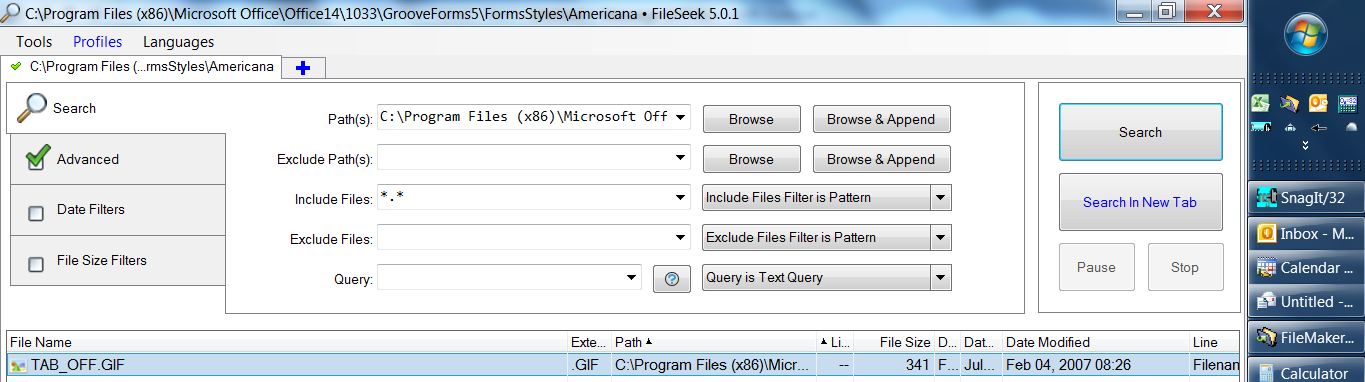
I like the way in version 5.0.1 there are buttons for the Advanced and Date Filters, without having to go to menus. My request would be to make some of the boxes smaller to allow a wider box for the Path(s). (Is this complicated by different users text size settings?)
I've attached a screen shot of my lap top. I keep the task bar on the right, not the bottom.
There is not enough length in the Path(s) box to see a long path text. Yes the title of the whole window at the top shows more of the path, but then in the twistie drop down to show previous search paths (useful feature), those are hard to see long ones.
Could I suggest in next version reducing the Advanced and Date Filters boxes width, removing white space from between the Search and Path(s), remove white space between Browse and Append and Search boxes, reducing the width of the Search button box, and put the horizontal space gained into a wider Path(s) box?
While on the precious screen real estate, also, by far my most used Advanced feature is turning on and off Search sub-folders. But I don't use Exclude Files nearly so much. Could these two be interchanged, with Search sub-folders on the same window as the Include Files: box, and Exclude Files and its box in Advanced? Is there a way to see how other users see this?
Thank you again for a great program!
FileSeek screen.png


